<< Part 9
How to approach colour as an illustrator?
A blog post is not a medium of adequate length to explain Colour Theory. If you want to learn colour, you need to take classes or read a book. The one I love is by James Gurney Color and Light: A Guide for the Realist Painter. He is an undisputed master and I feel I need to go back an re-read his book, because I feel I have forgotten the many lessons it has to teach. I also took Schoolism classes. “Painting with Light and Colour” by Robert Kondo and Dice Tsutsumi is great and easy to follow. “Fundamentals of Lighting” by Sam Nelson defeated me. This man is brilliant, but that course is far too scientific for someone with my needs. There is also “Designing With Colour and Light” by Nathan Fowkes, who is another undisputed master, but I have yet to work through his course.
James Gurney and Nathan Fowkes have great YouTube channels as well.
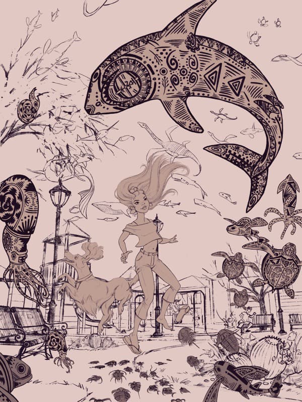
In this blog post, I will walk you through my thought process as I paint colour for my Ghost of an Ancient Ocean illustration inspired by the novel Elatsoe by Darcie Little Badger.
After I finished inking the illustration, I had to decide on how I was going to approach colour. As an illustrator I have two options: paint colour tests or straight ahead painting.
Colour Tests
To save time and money, if I have a complicated painting or one that is to be finished traditionally, I always create colour tests. I do these digitally. I take my finished line or sketch and shrink the artwork down to max 2 inches in width. Then, I grab my Colour Wheel and thinking about what mood I wish to create in the finished piece, I try to come up with some unusual colour schemes for my palette.

Mili Fay’s Colour Wheel
Colour Scheme is a choice of colour used in the artwork. Colour Harmonies are colour relationships that result in pleasing colour combinations as determined by Colour Theory. The available options I know of are: Mono-chromatic, Analogous, Achromatic, Complementary, Split Complementary, Diad, Triad, and Tetrad.
I test out colour schemes by quickly painting miniature paintings using as large a brush as possible — not going into detail, but thinking of my light source.
Depending on how much time I have, I paint anywhere from 3 to 10 of these little paintings. Then, I choose the one I like best. Sometimes, usually when I like two or three paintings and cannot decide which one I like the most, I allow my Instagram Followers to make the decision for me.
Straight Ahead Painting
In this case, since the illustration was not for a client and since it was to be painted digitally, I decided to skip colour testing and just start painting. DO NOT choose this option unless you have years of education, practice, and experience.
This illustration is insanely complex. It has many elements. If I did not know what I was doing, it would have gone horribly wrong.
Amongst the lessons I learned from James Gurney’s book, the one I remember best is that colour is not as important as value. This means that if your values (your painting in grayscale) looks good, it does not matter what colours you place on top.
Another is that colours depend on the light source. Each objects has Local Colour (the way that object would look under neutral white light). The colour of the object changes depending on the colour of the light.
Since this scene is happening outside, there is also atmosphere to worry about. During daytime, even in clear conditions, objects that are closer to us appear more saturated with higher contrasts than the same objects that are far in the distance. The farther into the distance that you look, the bluer the objects become. This is because moisture and tiny particles of dust in the air scatter the light, and the short wavelength — which corresponds to blue light — is scattered the most. This is known as Areal or Atmospheric Perspective.
Looking at my illustration I decided that there are three levels to this image. The background, the middle ground, and the foreground.


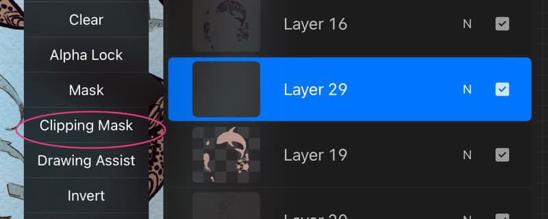
To make it easier for myself, I painted these separate layers in flat tone. This allows me to clip a new layer to the painted layer one below and create a mask, which in turn allows me to paint without worrying about painting outside of the lines.
Painting
In my head I can see what the illustration should look like, but to get there I need to break my painting into steps.
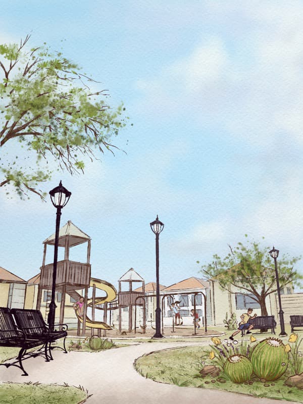
I begin with the background. A background should not stand out and compete with the characters. It exists to provide information about the setting and the characters. Therefore, looking at my reference, and using my Tsvetka Watercolour Brushes, I begin by painting the most distant element of the background — the sky.
The time of day is mid-day. The sky is a bright and brilliant blue. However, this is not the story about the sky. I keep the brilliance, but instead of trying to match the realistic colour of the sky, I make my value very light — a light watercolour wash. Then I paint in the clouds. These are not contrasting easy to spot clouds. They nearly fade into the sky. In this way I tell the viewer that there are clouds in the sky, but they are not important.
You may ask me: “If they are not important, why are you painting them?”
Composition. The clouds exist to keep the viewer’s eye from leaving the page. If you look at them carefully, you can see that they are all pointing back to the middle of the painting.

Then I begin to paint the park. This day is warm. The scene is warm. What colour is associated with warmth? Yellow. Therefore, I choose to stick to yellows, yellow-oranges, and yellow-greens for this small Texas town park.
Notice how I think of atmospheric perspective, making the buildings in the back bluer and less saturated? Increasing saturation and texture in the foreground?

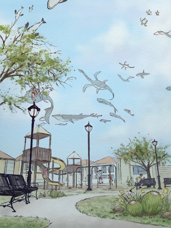
I painted the background creatures, keeping to that same rule of desaturation and blue. Then since this scene is supposed to be happening under the vision of a ghost ocean, I created a new layer, filled it with blue, and played around with Layer Modes until I reached the desired look.

Next, using the clipping mask, so that I would not paint outside of the lines, I paint the two main characters: Elatsoe and Kirby. As I paint, I’m not thinking so much about the light source. I’m painting them in local colour thinking about the form. The light is coming from above.

I felt that the aqua blue of Elatsoe’s shirt blended too much with the background. Elatsoe is the main character so she should have the most contrast. I changed her shirt to white.

I painted the creatures. Notice how the creatures in the foreground are darker, warmer, and less saturated than the ones in the middle ground.

This is what the illustration looks like painted with local colour. Can you guess the Colour Scheme? Can you see Colour Harmony? Look at the most visible colours in this painting. There is red, yellow-green, and blue-green which would make this painting a Split Complementary colour scheme. However, there is also orange, yellow and touches of blue. Huh?
There is no Colour Harmony! This Colour Scheme is a mess.
How can I unify this painting and make it look like all those colours belong there?
Light. Value.
The next step to this painting is to add light and effects.
In a traditional painting, all of this would have had to be figured out prior to painting. However, when painting digitally it is really easy to add different kinds of light playing around with layers and layer modes. In the next article, I will show you how.

H.O.O.T.s of Wisdom
Value is more important than colour. If you get your values right, you can choose whichever colour you like for your painting. Try this digitally by painting your illustration in black and white. Then add another layer on top and change the mode from Normal to Color and add colours as you wish.
Local colour of the object changes based on the light source. Paint your illustration in local colours then use layers set to Multiply and/or Linear Burn to add shadows and use layers set to Screen, Hard Light and/or Soft Light to add light to you illustration. Don’t forget to change the opacity of the layer if the light or shadow is too bright/dark. Play with different colour combinations. To start, I suggest using complementary colour scheme. Ex: Yellow Light/Purple Shadow
If your painting has depth and is happening outside use areal or atmospheric perspective — as the objects recede into the background they become less saturated and more blue, contrast decreases, brightness increases, the edges remain sharp, unless there is an increase in haze (fog). Finally, a strong light source may weaken atmospheric perspective by creating strong contrast in the background. For example, a bright sunset light hitting the edge of a mountain.
